Aruba National Park Foundation
What: Verbal and Visual Identity for Aruba National Park Foundation at How&How.
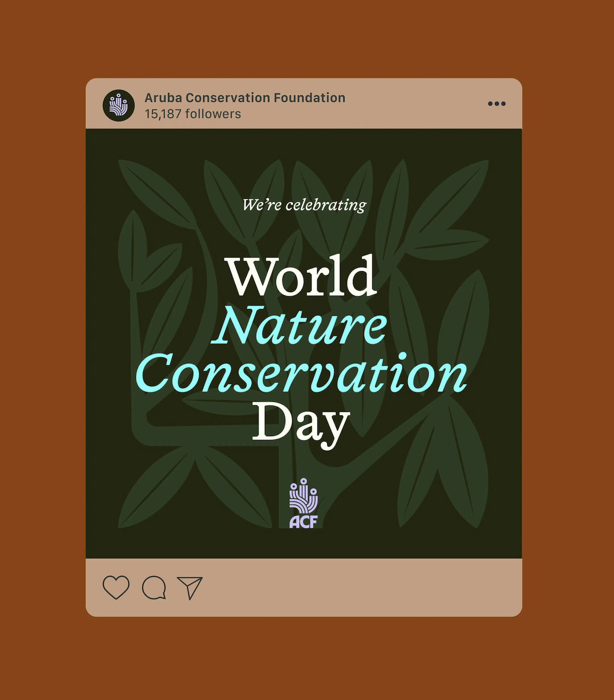
The Project: Aruba National Park Foundation (now the Aruba Conservation Foundation) is the appointed nature conservation organization on Aruba, tasked with protecting over 24% of the island’s natural habitat, both terrestrial and marine. We partnered with the ACF to create a new brand capable of rallying local support for Aruba’s diverse ecosystem, biodiversity and natural heritage including caves, wetlands, mangroves, dunes and the flora and fauna that inhabit these protected sites.
Given the sincerity of their objective, we positioned the ACF as Aruba’s Voice of Nature: an organisation speaking up for the interests of local ecosystems and reminding locals of their ties with the land. By framing the brand’s role as a spokesperson for overlooked species and ecosystems, it was our intention to communicate the sincerity of our intentions to Aruban communities and prompt them to remember their oneness with the natural world.
This metaphor also laid the groundwork for our visual identity and verbal identity, laying the ground work for the tagline “Together for nature.” which speaks to humanity’s spiritual connection to nature, while drawing on iconography to bring focus to specific species and ecosystems. A complex color palette designed to match the different geographical areas of the National Park - dunes, marshes, the ocean and scrubland - was developed; alongside a modular illustration system where plants and animals are able to ‘grow’ to fit whatever size of layout they need.
The brand that results is all about translating the needs of nature into tangible action by using a compassionate authority that the ACF can own for years to come.
My Role: Lead Copywriter
Press: Brand New, Creative Review
The Team: Thanks to ACF and the amazing team at How&How — Cat How, Chris Beck, Jack Wimmer, Joana Jardim, Lucy McGinley, Eilidh Reid, and many more.